Colour Psychology: Branding in learning and teaching institutes
Results have shown that different colours or hues have strikingly different effects, and the impact of colour is often overlooked. Colours inherently play a role in emotion, productivity, communication and thinking. Such an impact ultimately affects an individual’s working and studying. The use of colour also helps define the purpose and act as visual cues when learning.
Blue, for example, is soothing and calming, while red encourages excitement. It is therefore important to keep in close consideration the main brand colours
We’ll take a closer look at colour psychology, how colour can alter the mood of your classroom, and review some best practices that can help you to heighten creativity and improve focus.
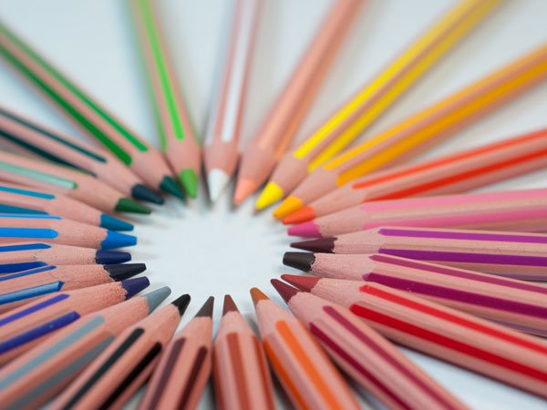
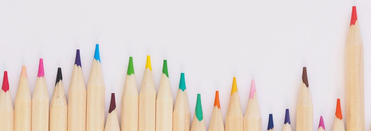
Each colour has a particular effect on mood. The entire colour spectrum is divided into two parts – warm and cool colours. The warm colours are more towards the hue red and cool towards blue. Warm colours exude energy, warmth, collaboration, teamwork, happiness and creativity but can feel chaotic or stressful. Cool colours, on the other hand, encourage calm, authenticity, trust, and productivity. Also, the amount of saturation on a certain hue defines the intensity of that specific colour. Intense colours tend to stimulate people, whereas less intense and subdued colours have a soothing and calming effect.
Let us look at some of the prestigious educational institutes in India and you can understand if their vision and mission are reflected in their visual composition
Yellow: Increases creativity and attention and instills a general feeling of positivity
Orange: Can improve alertness
Green: Peaceful and calm

Blue: Calming environment
Purple: Peaceful and calm

Brown: Can reduce feelings of fatigue and improve feelings of relaxation or make students feel more secure

Off-White: Improves attention and instills feelings of positivity

Red: Inspires alertness, excitement and creativity
Although colour psychology is being utilised by interior designers for decades in living spaces, its application in classrooms and educational institutes is still trumped by bias towards functionality.